UP Trans launches new LOGO icon
EditorŁşUP Trans TimeŁş2020-12-31 Page viewsŁş824
As the core element of the enterprise brand, the company LOGO logo is the embodiment and carrier of the company's image. In order to further enhance the company's brand image, we have adjusted the LOGO icon.
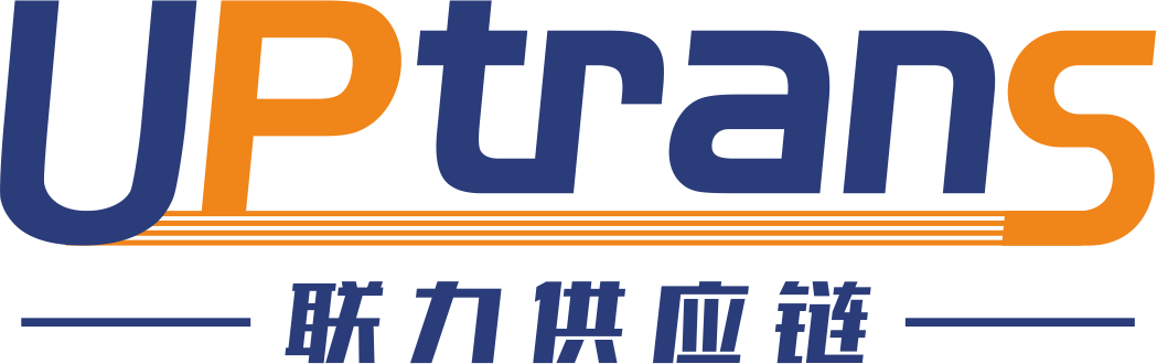
Picture: LOGO icon
ˇ®UptransˇŻ is the main body of the LOGO, which is simple and elegant, inclusive and collective.
The four orange-yellow horizontal lines at the bottom connect the main part of the LOGO, which represents: the idea of gathering strength of customers, suppliers, shareholders, and employees to develop together.
The overall shape of the LOGO resembles a sailing ship. Gather strength, overcome difficulties.
The main color of the LOGO is blue, which represents: broad, steady, and peaceful; orange-yellow represents: vitality, bright, and strength.
The Chinese character ˇ®United Power Supply ChainˇŻ directly reflects the characteristics of the industry.
Picture: Monochrome logo icon
Our company has now fully enabled the use of the new LOGO icon, and standardized the scope and method of use.